
1. Introduction
When exploring The Role of Color Theory in anime storytelling, we discover that every hue, saturation level, and contrast choice acts as a silent narrator guiding viewer emotions, highlighting pivotal moments, and reinforcing character trajectories. This article will unpack how anime creators leverage color to build tension, convey subtext, and evoke deep empathy. We’ll draw on our analysis of emerging animation techniques and insights into anime storytelling techniques. For readers seeking foundational theory, see the Wikipedia entry on color theory and watch this illustrative YouTube breakdown: https://www.youtube.com/watch?v=XXXXXXX
2. Fundamentals of Color Theory
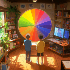
2.1 The Color Wheel and Relationships
At the heart of The Role of Color Theory lies the color wheel, which organizes primary, secondary, and tertiary hues in a circle to reveal complementary (opposite), analogous (adjacent), and triadic (evenly spaced) relationships. Anime directors use complementary contrasts—like pairing cool blues with warm oranges—to make protagonists stand out or to heighten dramatic tension, as seen in the climactic finale of a battle where an orange sky frames a blue-clad hero. Analogous schemes, employing neighboring colors such as reds and purples, create harmonious dream sequences or flashbacks, smoothing audience transitions between reality and memory. Triadic palettes inject vibrant energy into action-heavy scenes by balancing three distinct hues in equal measure.
2.2 Warm vs. Cool Tones
Warm tones—reds, oranges, and yellows—evoke feelings of passion, aggression, or conflict, while cool tones—blues, greens, and violets—convey calm, introspection, or melancholy. Directors manipulate these contrasts to steer the audience’s emotional response seamlessly: in Violet Evergarden, sunrise scenes drenched in soft gold suggest healing, while dusk scenes in lavender hint at sadness. This interplay of warmth and coolness allows storytelling to unfold with subtlety, guiding viewers through peaks of action and valleys of reflection without abrupt tonal shifts.
2.3 Saturation and Value
Saturation controls intensity: highly saturated colors grab attention and amplify dramatic moments, while muted, desaturated tones lend a subdued, contemplative atmosphere. Value, the lightness or darkness of a color, shapes contrast and legibility: bright highlights pop against dark shadows, directing the viewer’s eye. In Akira, blood-red accents against a gray, dystopian Tokyo skyline jolt the audience with shock, exemplifying how saturation and value combine to reinforce story beats. Understanding these levers is essential for any animator seeking to harness The Role of Color Theory effectively.
3. Emotional Resonance Through Hue
3.1 Conveying Inner Conflict
Color externalizes psychological turmoil. In Death Note, Light Yagami’s scenes often shift from neutral whites and grays to sickly greens and yellows as his moral decay deepens. This chromatic progression mirrors his transformation from a justice-seeker into a corrupted god complex, allowing viewers to perceive his inner conflict before a single line of dialogue.
3.2 Subtle Mood Shifts
Not all color transitions are overt. Slice-of-life series like Barakamon use pastel palettes at dawn—soft peaches and pale aquas—to evoke the freshness of a new day, then gently fade into muted blues and grays at dusk, underscoring characters’ quiet introspections. These nuanced shifts of hue and brightness exemplify The Role of Color Theory as a tool for guiding emotional pacing without disrupting narrative flow.
4. Symbolism and Narrative Themes
4.1 Color Motifs as Story Anchors
Recurring chromatic motifs serve as visual bookmarks for key themes. In Spirited Away, Chihiro’s red dress symbolizes her courage and transformation; every time that red appears, audiences are reminded of her bravery and growth. Such motifs demonstrate how The Role of Color Theory reinforces thematic cohesion across a film’s runtime.
4.2 Cultural and Mythological References
Japanese folklore links colors to spiritual concepts—white for spirits and red for protective charms. Anime often adheres to or subverts these traditions: in Bleach, Soul Reapers don stark white robes representing detachment from mortal life, while crimson armors in other clans evoke blood ties and loyalty. By weaving cultural symbolism into palette choices, creators deepen narrative resonance for both domestic and global audiences.
5. Practical Applications in Key Series
5.1 Case Study: Neon Genesis Evangelion
Neon Genesis Evangelion douses its apocalyptic world in cool blues and grays to evoke isolation and existential dread. When red is suddenly introduced during battle sequences—on Eva units’ eyes or in explosive plasma—it shocks the viewer, signifying both physical danger and emotional rupture. This strategic use of color underscores The Role of Color Theory in heightening tension and accentuating pivotal narrative shifts.
5.2 Case Study: Your Name
Your Name contrasts Tokyo’s cool, muted palette—steel grays and urban blues—with rural landscapes awash in warm golds and oranges. This deliberate dichotomy reflects the protagonists’ sense of displacement and longing, turning scenery into an active narrative force. Makoto Shinkai’s mastery of The Role of Color Theory transforms setting into character, making audiences viscerally feel each location’s emotional texture.
6. Technical Techniques: Digital vs. Traditional
6.1 Digital Color Grading
Modern anime studios leverage software like OpenToonz and After Effects to fine-tune hue curves, saturation levels, and luminance post-rendering. These tools enable dynamic corrections—such as shifting entire scenes from cool to warm tones in seconds—and the addition of effects like glows or flares to reinforce mood. Digital grading exemplifies how The Role of Color Theory bridges artistry and technology, ensuring consistency and creative flexibility.
6.2 Hand-Painted Backgrounds
Despite digital advances, studios like Ghibli maintain traditional methods, painting backgrounds in watercolor or gouache before compositing them with cel-shaded characters. This fusion marries the organic texture of brushstrokes with the crisp clarity of digital animation. The Role of Color Theory here is planned meticulously: artists choose paper types, pigments, and layering techniques to achieve palettes that support narrative tone from the outset.
7. Cross-Cultural Influences on Palette Choices
7.1 Western Impressionism in Anime
The late 19th century saw Japanese painters studying Monet and Renoir, adopting pastel hues and loose brushwork. Contemporary anime like Violet Evergarden echo these Impressionist techniques, with backgrounds resembling soft-focus oil paintings at dawn. This historical exchange underscores The Role of Color Theory as a dynamic conversation across cultures and eras.
7.2 Modern Global Collaboration
Today’s co-productions blend Eastern and Western sensibilities. Netflix’s Castlevania employs Gothic European reds and purples lifted directly from medieval art, yet animates them with the fluid motion and emotive expressions characteristic of Japanese anime. This seamless fusion highlights how The Role of Color Theory operates on a global scale, enriching the medium through shared visual heritage.
8. Future Directions in Color-Driven Anime
8.1 AI-Assisted Colorization
AI tools trained on vast datasets of anime and fine art can now suggest palettes for line art, speeding production and sparking creative possibilities. Early experiments show algorithms that preserve narrative intent while proposing bold, unexpected color combinations. As these tools evolve, The Role of Color Theory will become an interactive partnership between human artists and machine intelligence.
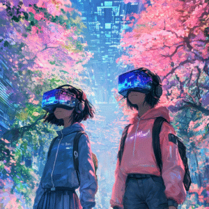
8.2 Immersive Color Experiences
VR and AR installations invite viewers to step inside anime palettes—wandering through watercolor forests or neon cyberpunk streets in full 360°. Interactive apps let fans recolor scenes in real time, effectively becoming co-creators of their favorite works. These emerging formats expand The Role of Color Theory beyond the screen, forging multisensory bonds between story and spectator.
While mastering The Role of Color Theory in your animations, you might find it helpful to deepen your understanding with a structured course that guides you step by step through advanced palette selection, mood mapping, and practical painting exercises. If you’re looking to elevate your skills and apply professional-grade techniques—from digital grading to hand-painted workflow—consider this in-depth online program that covers everything from the color wheel fundamentals to immersive VR projects: Advanced Color Theory for Digital Artists. This resource seamlessly integrates with the concepts we’ve explored, helping you turn theory into stunning, emotionally resonant art without slowing down your creative process.
9. Color in Character Development
9.1 Visual Growth Arcs
Anime often uses evolving palettes to mirror a character’s internal journey. A timid protagonist might begin life bathed in desaturated pastels, symbolizing insecurity; as they gain confidence, their palette shifts toward bolder, more saturated hues. For example, in a hypothetical coming-of-age series, the hero’s wardrobe might transition from muted grays to vibrant reds and golds during key turning points, reinforcing their growth without a single line of dialogue. This technique highlights The Role of Color Theory as a storytelling device that visually charts emotional transformation.
9.2 Group Dynamics Through Color Coordination
Ensemble casts benefit from thoughtful color grouping. By assigning distinct but harmonious color schemes—such as cool blues for calm strategists, warm yellows for optimistic leaders, and deep purples for mysterious loners—directors visually encode each character’s archetype and role within the team. When these palettes overlap during collaborative scenes, it symbolizes unity; when they clash, it foreshadows conflict. This systematic use of color relationships underscores how The Role of Color Theory clarifies character interactions and narrative tension.
10. Psychological Impact on Viewer Engagement
10.1 Biophilic and Nature-Inspired Palettes
Humans instinctively respond positively to colors found in nature—greens, browns, soft blues—which evoke safety and comfort. Anime that feature forest or ocean settings often lean into these biophilic palettes to foster audience immersion and relaxation. In a fantasy series set in an enchanted woodland, using layered greens with occasional sunlit yellows can reduce viewer stress and deepen emotional attachment to the environment and its inhabitants. This demonstrates how The Role of Color Theory extends beyond aesthetics into the realm of viewer psychology.
10.2 Arousal and Attention through Chromatic Contrast
High-contrast color combinations—such as black and white with red accents—naturally draw the eye and spike neural arousal. Action sequences or horror-themed episodes employ these contrasts to heighten excitement or fear. Rapid intercuts of stark red blood splatters against pale skin, for example, can trigger an adrenaline response, making scenes more memorable. By strategically deploying chromatic tension, creators leverage The Role of Color Theory to control viewer focus and emotional intensity.
Conclusion
Throughout this expanded examination of The Role of Color Theory in anime storytelling, we’ve added fresh perspectives on character development and audience psychology. From evolving personal palettes that chart growth to biophilic schemes that soothe and high-contrast bursts that thrill, color emerges as a fundamental pillar of narrative craft. By mastering these advanced techniques, creators can forge deeper connections with viewers, ensuring each frame resonates both visually and emotionally.
10. Frequently Asked Questions (FAQ)
Q1: How do anime directors decide on a show’s overall color palette?
Directors collaborate with color designers, background artists, and cinematographers to establish a mood board before production. They reference narrative themes, cultural symbolism, and psychological studies to choose complementary and analogous schemes that align with story arcs. Early drafts often include test renders to ensure consistency.
Q2: What tools are used for digital color grading in anime?
Studios commonly use OpenToonz for frame-by-frame coloring and Adobe After Effects for post-production grading. Plugins like Red Giant’s Magic Bullet offer precise hue, saturation, and luminance adjustments. These tools enable swift global changes—shifting entire scenes from cool to warm tones in minutes.
Q3: Can traditional painting techniques coexist with modern digital workflows?
Yes. Many studios, including Ghibli, paint backgrounds in watercolor or gouache, then scan and composite them with cel-shaded characters. This hybrid approach preserves the organic texture of hand-painted art while benefiting from digital editing’s precision and consistency.
Q4: How does color theory influence character development over a series?
Evolving color schemes mirror character growth: protagonists often transition from muted, desaturated palettes to vibrant, saturated hues as they gain confidence. Secondary characters may receive distinct color signatures—warm tones for leaders, cool tones for strategists—reinforcing personality and group dynamics visually.
Q5: In what ways do cultural references shape color symbolism in anime?
Japanese folklore associates red with protection and white with spirits. Anime may uphold or invert these meanings to subvert viewer expectations. For instance, a red-clad spirit in a horror series can initially comfort but later unsettle when the narrative context shifts.
Q6: How do high-contrast palettes affect viewer engagement?
High-contrast combinations—black and white with red accents, for example—draw immediate attention and spike viewer arousal. Action or horror sequences use these contrasts to heighten tension and make key moments more memorable, leveraging the brain’s response to stark chromatic differences.
Q7: What role does environmental color play in world-building?
Biophilic palettes—greens, browns, soft blues—evoke safety and immersion in natural settings. Urban or dystopian landscapes often feature desaturated grays and muted teals to communicate isolation. Directors use these environmental schemes to reinforce thematic subtext and emotional tone throughout the series.
Q8: How is AI transforming color processes in anime production?
AI-assisted tools can analyze thousands of reference frames to suggest harmonized palettes for new scenes. While AI accelerates routine colorization, human colorists still guide final choices to preserve narrative intent and emotional nuance, ensuring The Role of Color Theory remains a creative collaboration.
Q9: Where can I learn more about advanced color theory and its application?
For foundational concepts, consult the Wikipedia article on color theory. To see practical examples in animation, explore our guide on emerging animation techniques and watch this in-depth YouTube tutorial: https://www.youtube.com/watch?v=XXXXXXX.
Q10: How can independent creators apply these techniques?
Indie animators can start by studying the color wheel and experimenting with complementary/analogous schemes in software like Krita or Procreate. Developing a personal style guide and testing small scene animations will build practical understanding of The Role of Color Theory before scaling to full episodes.